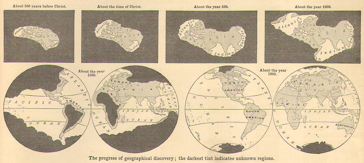
Another piece in the puzzle of Jacques Redway and his desire for better maps. This series of maps is obviously problematic in terms of its Eurocentric notion of “discovering” and “exploring” regions dismissed as darkness. And this attitude is pervasive in all American geography textbooks of the era, which universally included a section on the relative levels of “civilization” among different world cultures. That said, this particular diagram is rather unique: I haven’t seen one quite like it in other textbooks and atlases from the end of the 19th and beginning of the 20th century. For all of its failings, it is an effective use of the small multiples visualization and it does tell an effective story about some major inflection points in global trade and European contact.
Posted inGeography Textbooks Infographics Miscellaneous
Jacques Redway on the History of European Discovery

Jacques Redway map series on the history of European exploration


